.png)
Applications
·
June 26, 2026
Diagnostic IA : les clés pour démarrer votre projet
Comment réussir le déploiement d'un agent IA en entreprise ? Découvrez la méthode en 4 étapes de Craft.ai pour auditer vos données et booster votre productivité.
Using Machine Learning to solve a problem is good, understanding how it does is better. Indeed, many AI-based systems are characterized by their obscure nature. When seeking an explanation, looking to understand how a given result was produced, exposing the system’s architecture or its parameters alone is rarely enough. Explaining that a CNN recognized a dog by detailing the Neural Network weights is, to say the least, obscure. Even for models deemed as glass-box such as decision trees, a proper explanation is never obvious.


However, a whole field of Machine Learning research is devoted to shedding new light to clear the way for any data scientist seeking to understand their models and make the end-user trust their inferences.
XAI or eXplainable AI refers to methods that make the behaviour and predictions of machine learning systems understandable to humans, interpretable.
Interpretability is critical for any complex system. It might be needed to be able to trust the system or to provide trust in the system. It can be a safety measure, for instance knowing the extent of your action space, and getting to know what the system cannot do. If ever those are not sufficient reasons to use XAI, the European legislation is getting tighter around AI usage and will enforce the proper understanding of high-risk AI systems. It can also help companies to comply with the already enforceable right to information of the GDPR.
Hopefully, many XAI tools are already implemented and available to data scientists through open source libraries. Those libraries are numerous and it can be hard to find which one fits best your usage while understanding the intricacies of the specific explanations provided.
This article is a guide highlighting some of the most promising XAI libraries along with some insightful examples.
%252520(1).png)
We explored all of the most popular XAI libraries along with some others, going through each one experimenting with their features, checking their documentation as well as their code repository. The result is summarized in the quadrant above, as well as the best, unavoidable and most promising libraries in this article.
To provide a good intuition of their quality, we classified those libraries using a quadrant with a two-axis system: Readiness for Production and XAI potency. The first one summarizes the usability of the library, including the quality of the code, its documentation, its ease of use, and how well the explanatory tool is explained to the user. The second represents the versatility of the XAI methods, and how relevant they are with respect to the research state of the art as well as the format/interactivity of the explanation.
For instance, AIX360 a library by IBM offers a wide range of home-developed XAI methods. On one hand, it has an interactive format specifically designed for the crafting of explanations which grades quite high in XAI potency; on the other hand, the code behind it is mostly code written by a few programmers originally for the sake of experimentations only and there seems to be no desire to elevate the library to the standards of regular ML libraries like scikit-learn.
For scikit-learn, while it is an outstanding Machine Learning library (if not the best) it is not among the best XAI library. The features proposed are scarce, mostly model monitoring or inspection like partial dependence plots. The implementation is good yet the documentation remains technical and does not help the user craft a good explanation.
Alibi combines the best of both worlds, their API is easy to use, the range of features proposed seems to be the biggest and above all the documentation sets a high standard.
Evaluating a tool that provides means for explanation crafting can be very different from evaluating a classic machine-learning or code library. Indeed, user understanding is at the core of the success of XAI. One cannot explain without understanding first: understanding both the explanation and its inner workings. We thus define the 4 principal axes of quality for an explainable AI library:
The sole purpose of XAI is understanding. Needless to say that it is fundamental to understand the explanation method itself. The three key elements each XAI user should possess are basic knowledge of what the method seeks to explain, a sketch of its inner workings, and what information can be extracted from its results. Proper documentation must include that along with a simple API.
Explanations are relative, there is no “one-size-fits-all” solution and more importantly, each expert/user/supervisor's minds are different. Hence, understanding can come from a multitude of points of view. Interaction, comparing different solutions, and toying with them allow the proper crafting of good explanations.
The quality and depth of the features. Many tools are proposed by the research explaining diverse parts of the machine learning pipeline; the evaluation relies on the quality and practicality of the API implementation and the relevancy of the XAI method.
Quality of the library in its classical meaning. The code examples need to work seamlessly. The repository needs to be maintained and documented, verifying when was the last commit, and whether the features proposed are deprecated or not. Pull requests are often a good indicator that if users face major problems they will ask the developers for a potential fix there. The responsiveness of the maintainers and the quantity and ‘popularity’ of bugs can be found there.
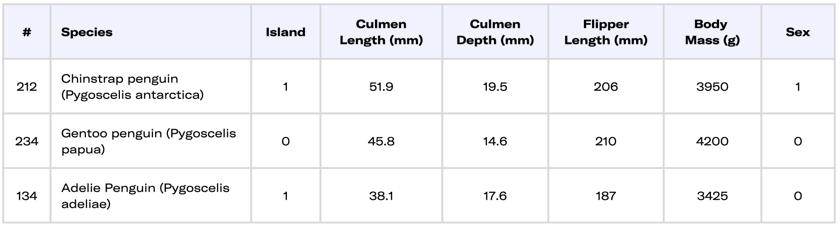
For illustrative purposes, the Palmer Penguins dataset will be used as a guiding thread to display some of the library usages.
A notebook with the full code to produce the explanation of these penguins is available here. You can download it and run it.
First, as we seek to explain an AI let's quickly load our data to then train machine learning models to infer the species given the physical characteristics of penguins.
Here is a quick peek at what the data looks like:
A plain table is rarely very insightful for the global picture, let's use some visualizations (PCA and TSNE) using the scikit-learn library. Explaining the data is one part of XAI. Both methods here are used to present the dataset and all of its features in a 2D plane. Note that the axis does not carry a specific meaning in penguin terms as they are a mix of different features.

Looking at this visualization which represents each penguin by a dot, the color representing their species, we can expect the Gentoo penguins (green) to be easily distinguishable while the Adelie (blue) and Chinstrap (orange) seem to be harder to split apart.
Now train a lightgbm model:
0.9912280701754386
The mean accuracy of our model is nearly perfect, which means only a few penguins are ill-classified in the test set. This indicates a good generalization. This score is for now our only guarantee for our model yet it does not give us any insight into his inner workings it is a mere statistical measure of performance.
How can XAI libraries allow us to go a bit further in the model analysis?
Alibi is an open-source Python library mostly maintained by SeldonIO.
The list of features proposed offers both global and local explanations, for tabular, text, or image data together with model confidence metrics.
To mention a few, instance-based explanations: Anchors, prototypes, counterfactuals; Feature importance explanations: Shap; Instance-specific scores for confidence: Trust-Score
Moreover, the quality of its documentation can be impressive such as the TreeShap page where the authors vulgarize the results from researchers going through extensive explanations to provide the best understanding possible to the user.
Additionally, many notebooks combine documentation and example of uses while allowing the user to easily re-adapt those to its application case. Besides the number of notebooks, they are well crafted and function without struggle.
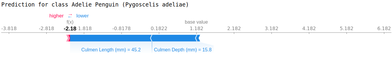
Let's observe alibi in action by examining our model for a penguin. We chose the following penguin, we like to call him Bob.
Penguin 269 (aka Bob)
First, we need some context on how Bob places itself in our model reasoning. For that, we use an anchor. The anchor provides simple rules sketching the model decision around Bob with a given precision and coverage.
Prediction: ['Gentoo penguin (Pygoscelis papua)']
Anchor: Body Mass (g) > 4700.00 AND Flipper Length (mm) > 210.00
Precision: 1.00
Coverage: 0.22
The model classifies BOB as a Gentoo. The anchor for this instance is constituted by the two rules up above.
As long as the anchor holds, the prediction remains the same (here with a perfect Precision). The anchors cover 22% of the time, this is the area where the explanation holds around the instance. This is less than the proportion of Gentoo penguins but it is an important amount.
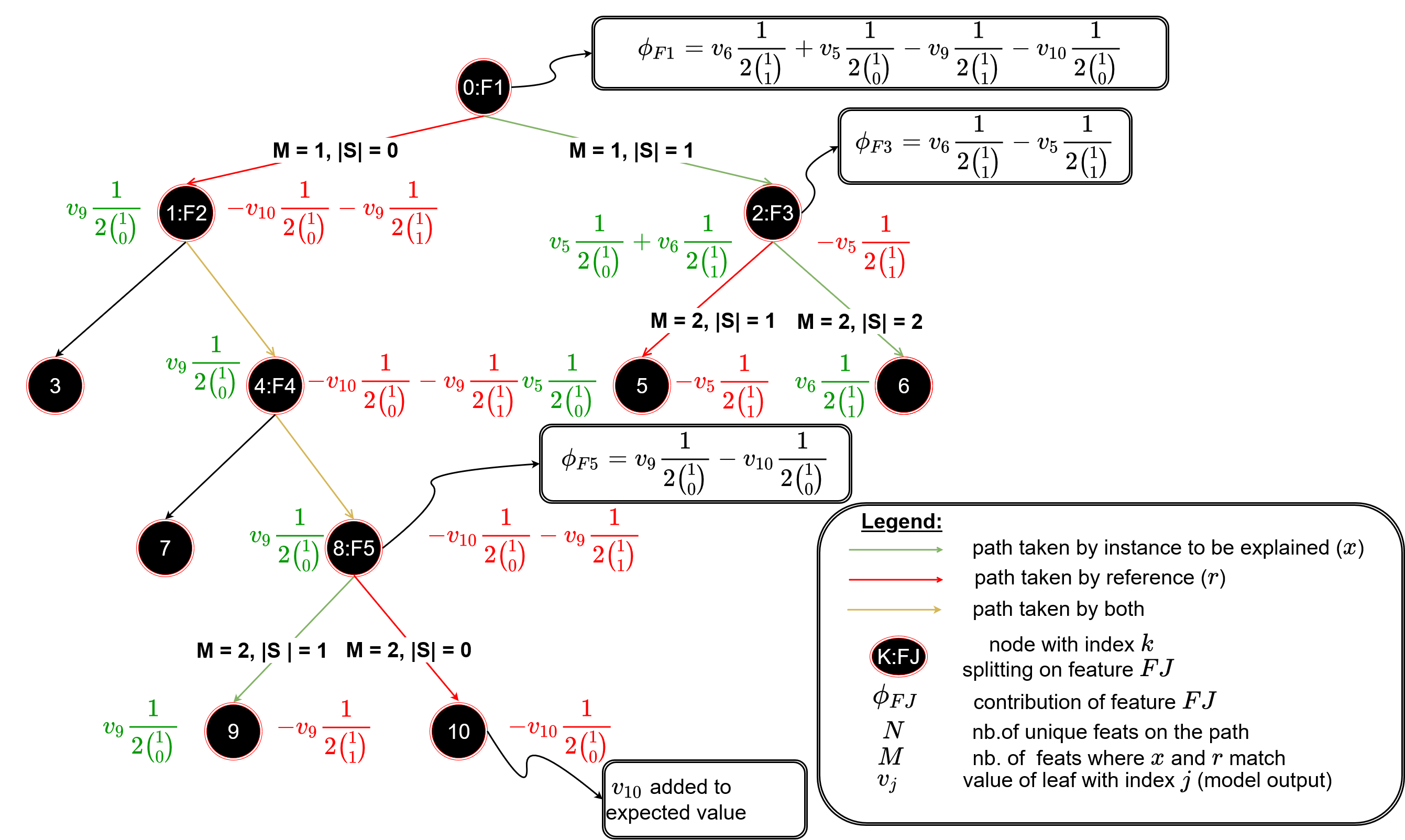
Now that we saw how Bob is classified as a Gentoo penguin we might want to understand how far he is from being considered by our AI as one of the other species. For that Alibi provides several methods to find counterfactual instances, penguins that would be close to Bob and inferred by the model as another class.
Counterfactual inspection

The counterfactual instance found by the algorithm resembles Bob, they only differ by the culmen proportion. Based on what our model learned if Bob had a wider and shorter culmen it would be classified differently as an Adelie Penguin (Pygoscelis adeliae).
As shown with Bob, ALIBI allows for an easy generation of various explanations. Thanks to the clear documentation we were able to detail the information provided by the code and extract key knowledge on both Bob and how our model works. Furthermore, the API is straightforward and the code works as indicated.
Shapley Values is a must-have for many XAI libraries. The versatility of this tool (local-global), the sheer explanatory power of the explanation and the model-agnostic potential make it a go-to XAI solution.
The reference library is SHAP maintained by Scott Lundberg the researcher introducing this concept of reward sharing among a coalition of players from the game theory to the machine learning world. The major strength of this library is the documentation through MANY notebooks with exact and detailed information describing what can and cannot be understood with Shapley values. It is also a way to display the versatility of what seems to be only one explanation while it is much more, it depends on what “reward” is decomposed toward which “players” as well as the potential global insights thanks to the additivity property.
Nevertheless, it is not the most robust library. Notably, their API changes regularly in an inconsistent fashion which creates inconsistencies between documentation and the code. It can be cumbersome to adapt Shap to your use case as some errors appear unclear.
Alternative displays and interfaces exist such as SHAPASH or ExplainerDashboard or directly through LightGBM and XGBoost models.
Shapley values for machine learning can be crafted to display for a given instance each feature contribution toward the model output. In other words, when our model infers a class for a penguin how did each feature contribute to this decision.
How did each characteristic of Bob contribute to his classification as a Gentoo Penguin? First, we compute our Shapley values with respect to our model.
The main strength of the library is its capacity to leverage the information offered by Shapley values through a diverse range of visualizations. Indeed, many explanations can be crafted with Shapley values and visualizations are one of the most user-friendly formats.
For Bob the Shapley values explanation for our model comes in that form:
The arrows correspond to the Shapley values, blue when negative and red when positive, one arrow per feature. They start at the model base values (indicated in the visual) and stack up naturally to the model output by property. Here the marginal output of the model is explained, the unit is in log odds ratios, and the bigger the more likely the class is. As the model is multi-output we dispose of 3 explanations for one inference, one with respect to each class.

For the Gentoo class, the one that the model infer, there are no negative contribution. The most contributing output toward this class for Bob is its Flipper having a length of 215 mm.
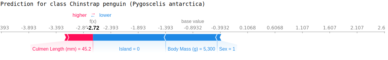
For the Adelie Class we find similar information as the one provided by the counterfactual method. Indeed the culmen proportion of Bob are the two main contributions toward indicating that it is not an Adelie Penguin (with respect to the model). The counterfactual method did add the information of how changing those features could shift the output.
The Shapley values of all penguins can be plotted together to have global insight into the model behaviour. For instance the global picture for Bob’s specie: Gentoo Penguins:
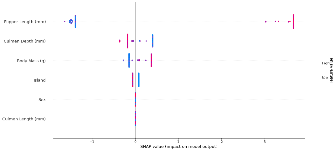
Each row corresponds to a feature. For each feature the colour represents the normalized feature value, the redder the higher the value. The horizontal axis corresponds to the Shapley value. Each point is a single penguin, they are stacked horizontally when having identical Shapley values.
Here the feature Sex and Culmen Length do not contribute to changing the output for this class as all contributions are 0 regardless of their value. The most distinctive feature of this class is the Flipper length which changes the output the most.
Here-bellow the same plot for the Chinstrap class presents a much more nuanced situation.

Shapley values are a really powerful mean to craft explanations and the Shap library leverages that really well through the diverse visualization seen. Furthermore, the documentation allows a proper extraction of insights into both data and the model. There are many more ways to use Shapley values, notably by decomposing the model’s loss rather than its output and more visualizations with Shap.

ExplainerDashboard is a perfect example of interactivity. Through a dashboard format, the user can easily toy with the different explanations presented. Starting from the data, passing by the model, and ending with inferences while at each step having a detailed explanation provide means for the user to extract the information he seeks.
This interaction is important in several aspects: First, the appropriation of the tool, understanding its inner workings, and developing good practices with the help of the documentation (note that the dashboard format can display the explanation and the documentation side by side); Second, trying to reach the limits of the explanation, what it can’t explain. The main downside of this approach is the confirmation bias [2], if some means of interpretability tend to match with the user’s intuition then he must proceed with the utmost care and go back to the documentation to check whether this conclusion can be drawn.
The diversity of the methods proposed and the diversity of points of view they allow being accessible nearly seamlessly position this library as one of the most usable for someone desiring to craft explanations or to understand their machine learning pipeline.
This library is backed by Microsoft and provides a similar medium as ExplainerDashboard. Added to that is present the dataset, indeed the data dimension is as important as the model providing direct access is key for the user to reach a proper understanding.
One downside of the dashboard format is it complicates comparisons that are not already included. For instance, one should easily compare different models and that is hardly feasible with the two aforementioned libraries.
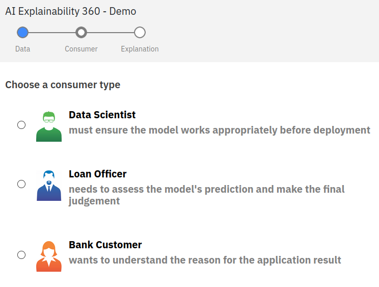
The IBM library distinguishes itself by offering a really good demo website around its library. Notably, the demo is very well designed for explanations. It offers to explore the variety of methods proposed around the use case of a loan refusal concerning various explainees. Understanding which explanation better fit a specific person is key to providing proper understanding. Their presentation of how XAI should be handled is very insightful and provides good guidelines. The three pillars of explanations exposed are the data, the explainer (Consumer) and finally the explanation.
Another great strength is that their methods are developed by their research team which ensures the coherence between the library and the uses they display while exposing alternative methods to other libraries. The more methods are available the more the field will benefit and reach out to more users sharing the benefits of explainability.
Some libraries are lesser-known however some aspects need to be praised.
This is the best library to generate partial dependencies plots and play with them. This kind of explanation is one of the easiest to grasp, having a library generating them easily and making them easily toy-able with is the greatest strength of Fat Forensics. The other great aspect is their roadmap which seems quite promising. However this library while active lately was stale for around two years without any commits. Users need proper maintenance of libraries to have a seamless experience with the tool.


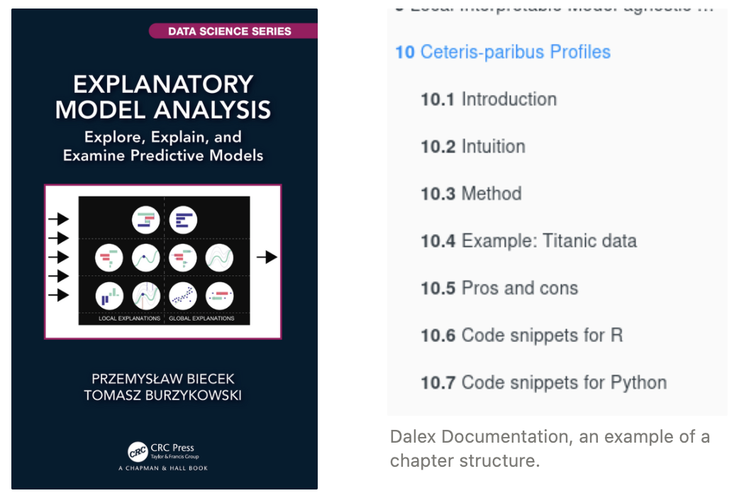
The importance of good documentation has been emphasized throughout this article, Dalex authors seem to share that conclusion as their documentation is extended by a whole book! Breaking down the intuition, and methods and going through detailed examples while indicating what conclusions can and cannot be drawn is essential. For each method offered to the user, there is a need to condense the guidelines and pitfalls shown in the state of the art; furthermore emphasizing the need for up-to-date libraries to maintain a relevant XAI library.
While the research field of XAI has the wind in its sails proposing a wide diversity of interpretability methods, there still are some wholes in the coverage of the machine learning landscape by XAI. Time-Series and their peculiar format that deserves specific time related-explanations are not present. The absence of any major Time-Series focused XAI library is directly linked to the small input from research. Nevertheless, the last years have seen the emergence of good candidates that have yet to go beyond the experimentation code phase.
Several flaws exist in the current state of XAI libraries, the most noticeable one being the lack of proper maintenance. Most of the time there is no desire to transform the libraries into robust and well-maintained code, the actors seem to be satisfied with providing various tools without going much further. Most libraries are just beautifully framed windows on the XAI research. This goes along with performance issues, the code is rarely optimized and this can heavily burden the development of the whole XAI field, a method not practical enough to use won't be popular. There is a huge opportunity to improve qualitatively the XAI tools offered for the explainer, the one crafting explanations and consequently the end-user, the explainee.
As emphasized throughout this article the documentation is essential, even more than the presentation of the result. Indeed, the existence of visualizations and the fact that the tools are publicly available or their popularity can lead to over-trust and misuse which is worse than not using XAI. Make sure to understand how your tool works and what information can be extracted or not from its results, this is fundamental.
On a final note, many tools exist and are available to use, go for it, explore, get to see your models, and your machine learning pipelines as you’ve never seen them before. Craft explanations to provide trust to the user, to ensure the safety of the usage of your machine learning pipeline. Let’s pave the way toward trustable machine learning through interpretability and better XAI practices.
As a final piece of content here is a big summary table of my personal view on the whole library ecosystem.
An article written by Bastien Zimmermann, R&D engineer, Craft AI
Alexa Steinbrück / Better Images of AI / Explainable AI / CC-BY 4.0